Interaction of Color
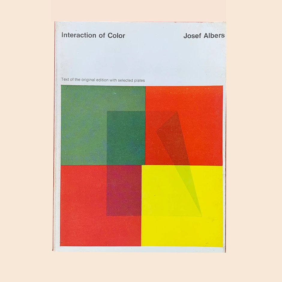
Josef Albers' masterpiece on color perception and relativity. Through nested squares and careful juxtaposition, Albers demonstrates that color is the most relative medium in art — a foundational text for any designer working with palette systems.
Extracted Palette Palettes are free. Exports aren't.
CSS Variables
:root {
  --palette-background: #F0E4C9;
  --palette-ink: #2E2014;
  --palette-accent: #C85A24;
  --palette-support: #6B8F5E;
  --palette-neutral: #D4A847;
}Tailwind Config
{
  "palette-background": "#F0E4C9",
  "palette-ink": "#2E2014",
  "palette-accent": "#C85A24",
  "palette-support": "#6B8F5E",
  "palette-neutral": "#D4A847"
}AI-ready Export this palette as COLORS.md for Claude, Cursor, and Windsurf.
Warm Monochrome Ramp
PAPER 100
WARM 200
WARM 300
WARM 400
WARM 500
WARM 600
INK 900
Your turn. Extract your own.